Our understanding of colour has developed over hundreds of years. What began as scientific discoveries about light and the visible spectrum has evolved into the sophisticated colour analysis systems used by consultants today.
Modern colour analysis is built upon the combined work of scientists, artists, educators and image professionals. Their discoveries continue to influence how colour is understood and applied across art, design, fashion and personal styling.
The Foundations of Colour Theory
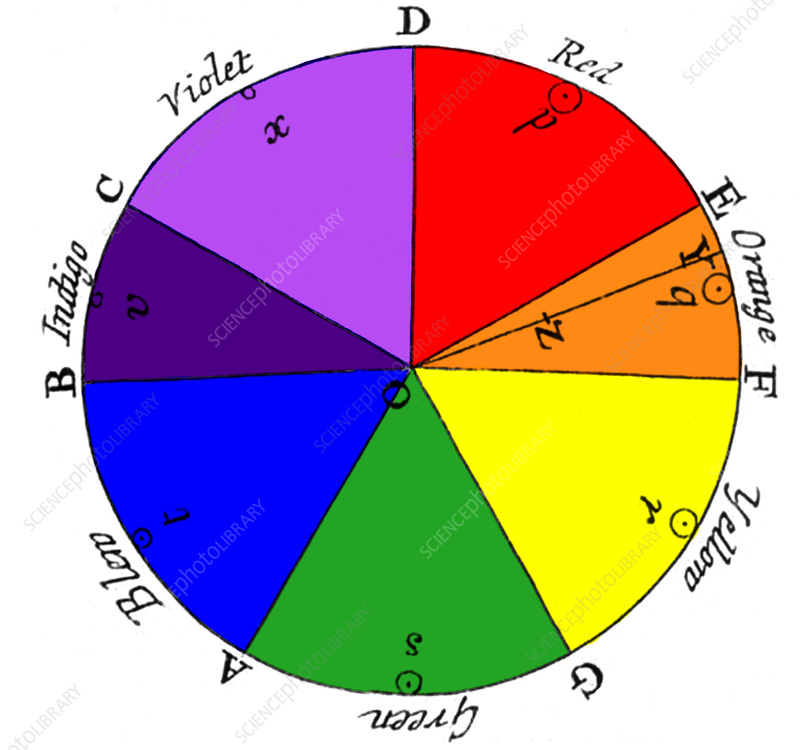
Although philosophers had debated the nature of colour for centuries, one of the greatest breakthroughs came in 1666 when Sir Isaac Newton demonstrated that white light could be separated into the colours of the spectrum using a glass prism.
Newton showed that colour exists within light itself, laying the foundations for modern colour science.
In the early nineteenth century, the German writer and scientist Johann Wolfgang von Goethe approached colour from a different perspective. While Newton focused on the physics of light, Goethe explored how humans perceive colour and the emotional and psychological responses it can create. His work influenced generations of artists and designers.
Later in the nineteenth century, the French chemist Michel Eugène Chevreul studied how colours appear to change when placed next to one another. His research into simultaneous colour contrast became highly influential in both fine art and textile design and remains an important principle in colour theory today.
Understanding Colour
During the twentieth century, colour theory became increasingly structured.
American artist and educator Albert H. Munsell developed the Munsell Colour System, organising colour according to three measurable characteristics:
- Hue – the colour family.
- Value – how light or dark a colour appears.
- Chroma – the intensity or purity of a colour.
These three dimensions continue to underpin much of modern colour education and help explain why two colours with the same name may appear very different.
Swiss artist and teacher Johannes Itten further expanded colour theory through his work at the Bauhaus school. His studies of colour harmony, contrast and warm and cool relationships remain some of the most widely taught principles in art and design.
Colour and Human Appearance
As knowledge of colour continued to grow, image professionals began to observe that certain colours consistently enhanced an individual’s natural colouring, while others could make the complexion appear dull, tired or uneven.
These effects were not based on fashion trends or personal preference but on the interaction between colour and the natural tones of the skin, hair and eyes.
Bringing Colour Analysis to the Public
During the late twentieth century, personal colour analysis became increasingly popular as consultants developed practical methods for identifying the colours that best harmonise with an individual’s natural colouring.
One of the most influential milestones came in 1980 with the publication of Carole Jackson‘s bestselling book Color Me Beautiful. The book introduced millions of people to the concept of seasonal colour analysis and helped bring personal colour analysis into the mainstream.
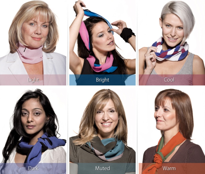
Since then, colour consultants around the world have continued to refine colour analysis systems. While different organisations may use their own terminology and approaches, they are all founded on the same core principles of colour harmony, temperature, value and chroma.
Colour Analysis Today
Today’s colour analysis profession is the result of centuries of scientific discovery, artistic exploration and practical experience. Building on the principles established by early pioneers of colour theory, consultants and educators around the world have developed a variety of colour analysis systems to help individuals discover the colours that harmonise with their natural colouring.
While these systems may differ in their terminology, methodology or level of refinement, they all share the same fundamental understanding of colour. Concepts such as hue, value, chroma, warmth and coolness remain at the heart of professional colour analysis, providing a common foundation across the industry.
At Direct Colour International, we recognise and support the diversity of colour analysis systems used worldwide. Our role is not to promote one particular approach, but to manufacture precision colour analysis products that enable consultants to work confidently within the system they have chosen. By providing consistent, accurately manufactured colours, we help professionals deliver reliable assessments while continuing the long tradition of applying colour theory in practice.
Why Precision Matters
The accuracy of colour analysis depends upon the colours being assessed.
If fabrics vary in shade or consistency, the results can be misleading. Professional consultants therefore rely on products manufactured to precise colour standards, ensuring that every comparison is accurate and repeatable.
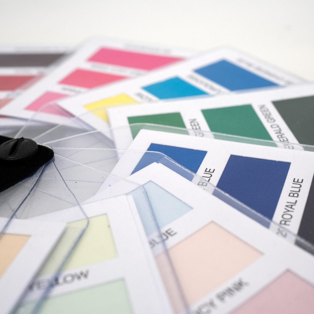
At Direct Colour International, we have specialised in manufacturing precision-dyed colour analysis products for professional consultants for many years. Our products are designed to provide consistent, reliable colours that support accurate assessments and dependable results.
Continue Your Journey
Colour theory provides the foundation for understanding how colours interact and influence appearance. The next step is to explore how these principles have been developed into the various colour analysis systems used by consultants today.
Our Colours
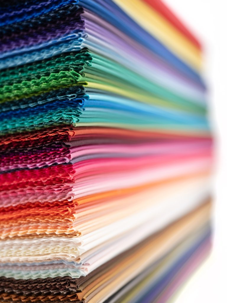
Our precision dyeing process guarantees accurate and consistent colours across 173 different hues, including metallics.
- Browse our entire colour range
- View each colour by season and tone
- Build your own drape selection
- Create bespoke swatch booklets by using the My Palette tool