Colour with Confidence
Spring/Summer 2027 is shaping up to be a season of contrast.
Bold, saturated colours sit alongside soft tints and understated neutrals, creating palettes that feel both expressive and wearable. From vibrant citrus tones and fiery reds to muted classics and barely-there pastels, colour is being used with confidence and purpose.
Whether you are creating colour systems, drape collections or bespoke swatch books, these emerging colour directions offer inspiration for the season ahead.

Gentle Hues
Soft, delicate and understated.
Pale blush tones, gentle creams and subtle pastel shades create a light, effortless feel that works beautifully alongside both neutrals and brighter accents.
Electric Citrus
Fresh, energetic and impossible to ignore.
Lively yellows and vibrant yellow-greens bring a sense of optimism and energy to the palette, creating combinations that feel modern and uplifting.
Bold Statement
Confident colour continues to make a statement.
Strong reds, vivid corals and intense pinks introduce warmth, energy and impact. Used alone or combined with deeper shades, they create bold and memorable colour stories.
Refined Neutrals
Timeless neutrals provide balance.
Warm stone shades, soft greys and understated taupes bring sophistication and versatility, offering a calming contrast to the season’s brighter colours.
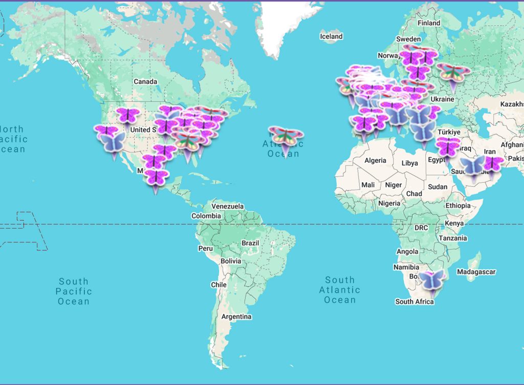
Find a consultant near you
If you are looking for an image consultant, we can help! Our map contains the contact details of hundreds of consultants all over the world.